White Noise
motion graphics // theatrical
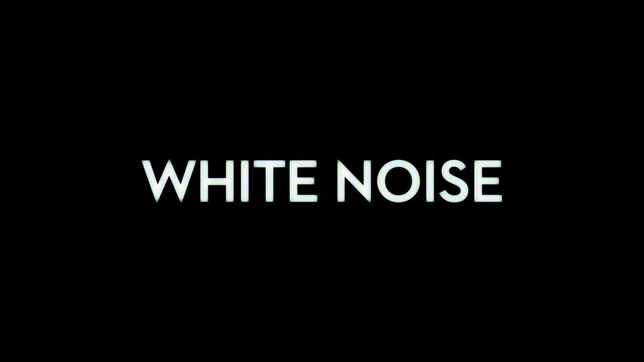
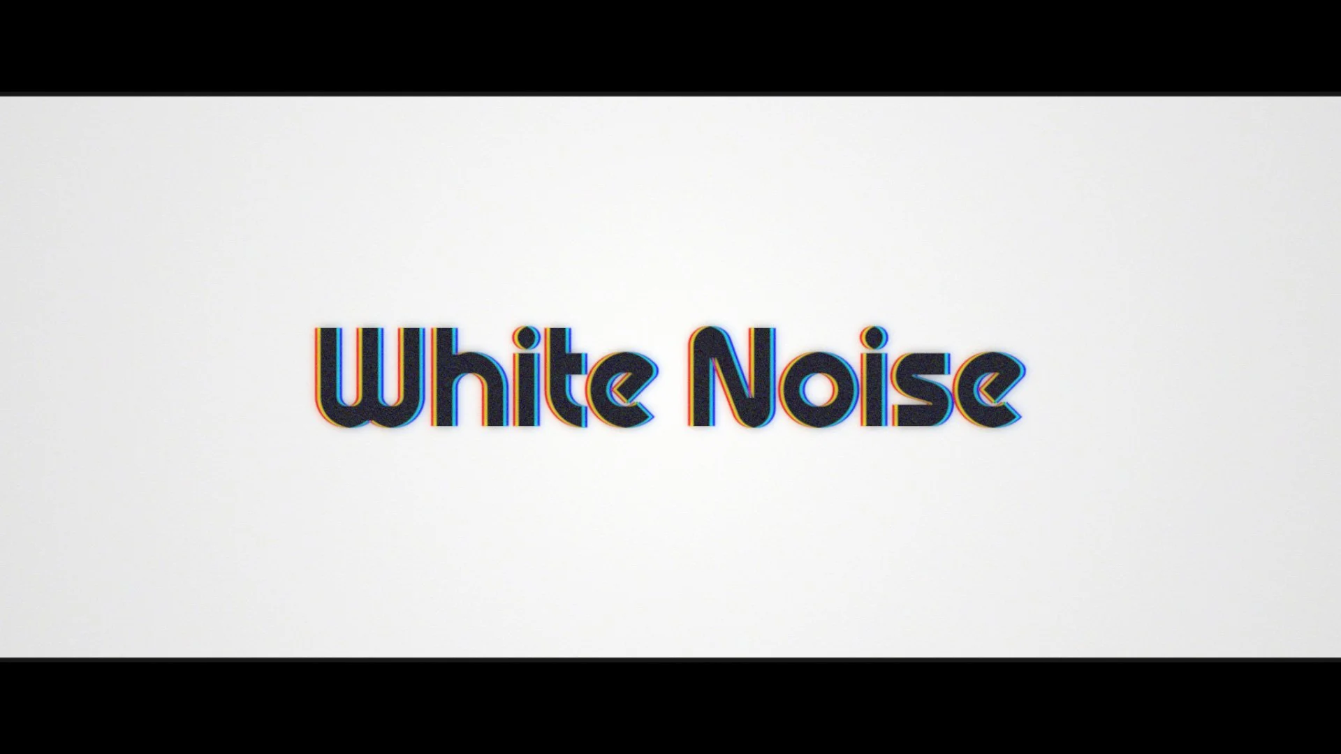
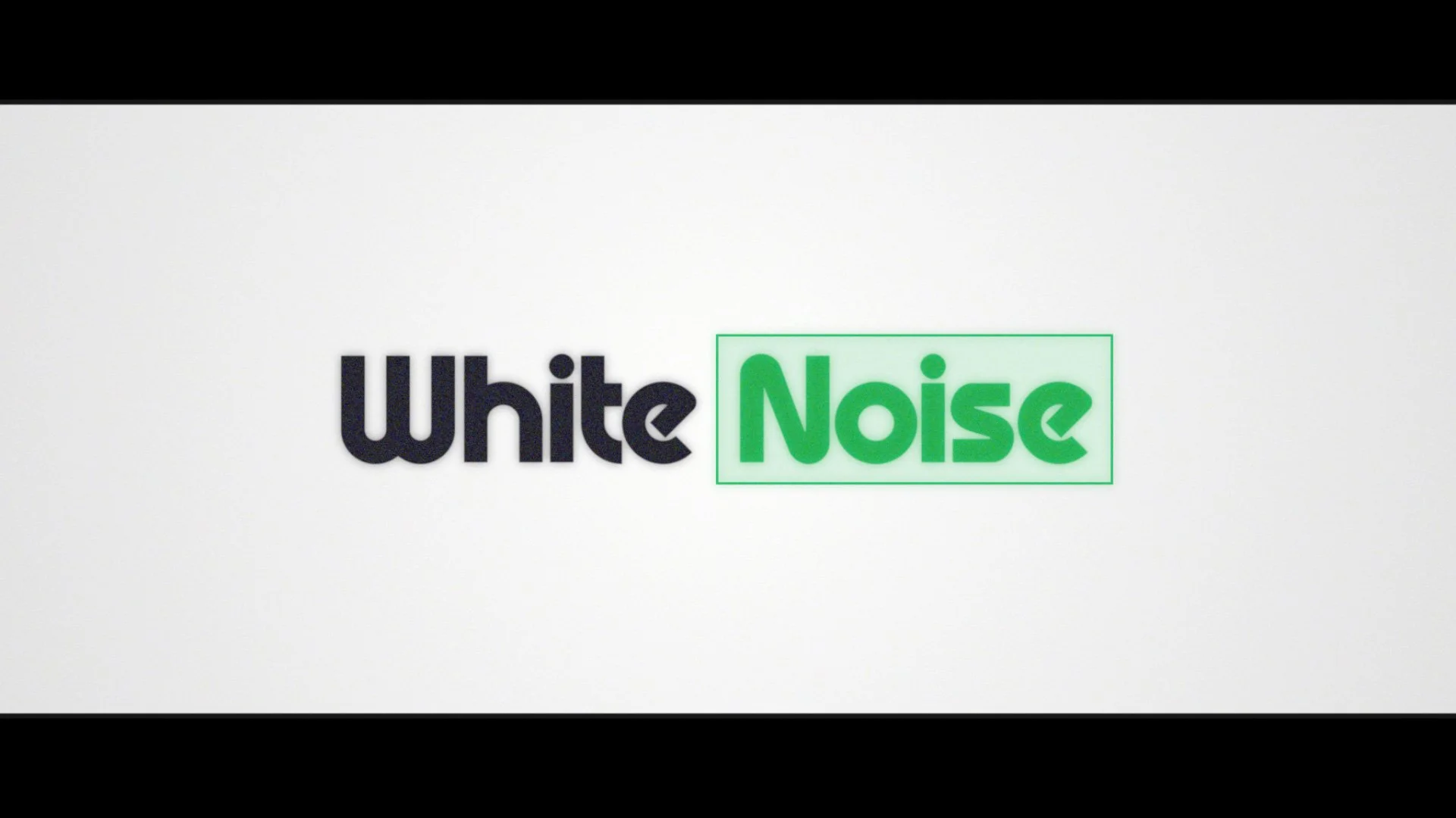
Similar to the novel it’s based on, this film is very dense in plot. There are a lot of moving pieces, a lot of tonal shifts, and for that reason I felt the graphics should be more understated than not. I felt anything that called too much attention to itself would stop the progression of the trailer and be more of a distraction. That’s not to say we didn’t try other ideas, however as we came closer to finish, we ended up returning to the initial look. I used Neutraface No. 2 as the main typeface because it feels “sometime in the 20th century”. I also used Corporate A Italic as a supporting face because I think it contrasts well with the bold sans serif. I additionally made the letters feel more “filmic” by softly burning the edges and slightly shifting the midtone (warm for intertitles, cool for main title). As for the main title, I had the word “noise” deplete into an outline — this felt appropriate with the static sound effect in use.

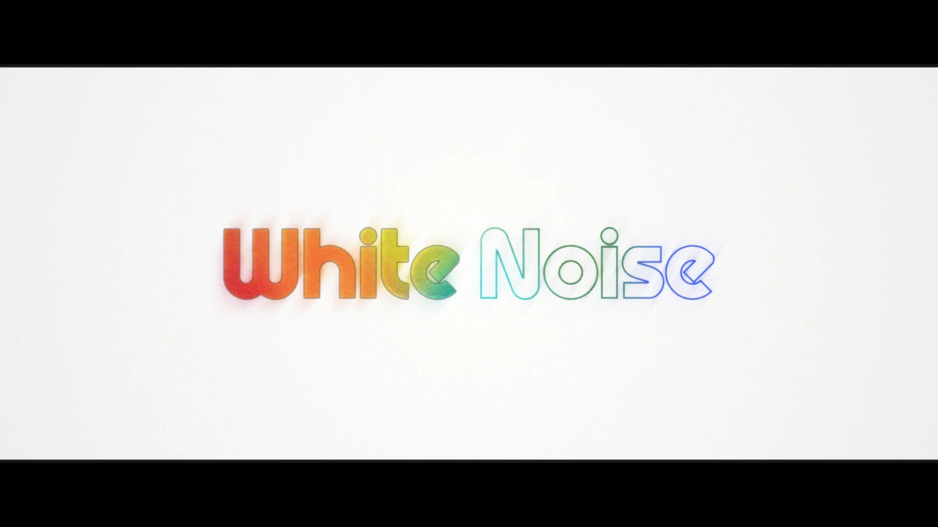
Below are some samples of other title treatment ideas we had explored, followed by the main teaser I worked on.
Main Teaser “Escape”