nomadland
motion graphics // theatrical and TV
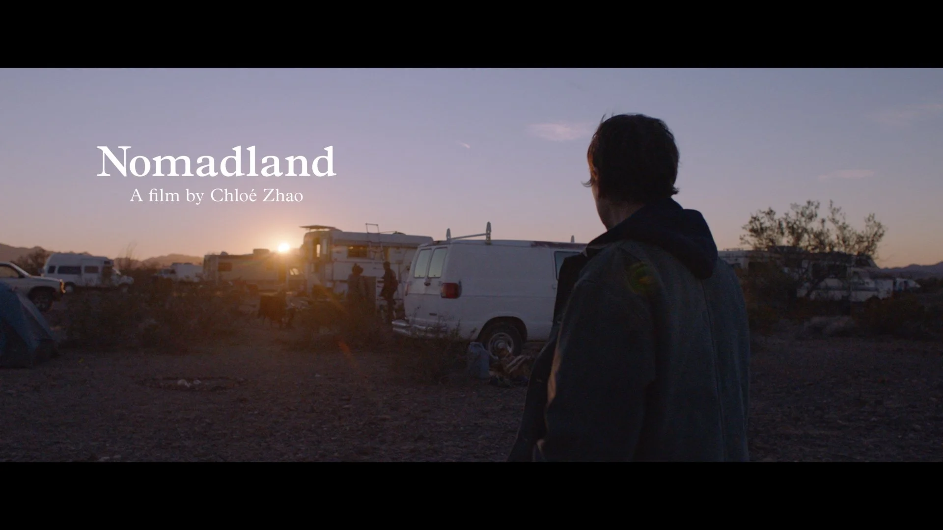
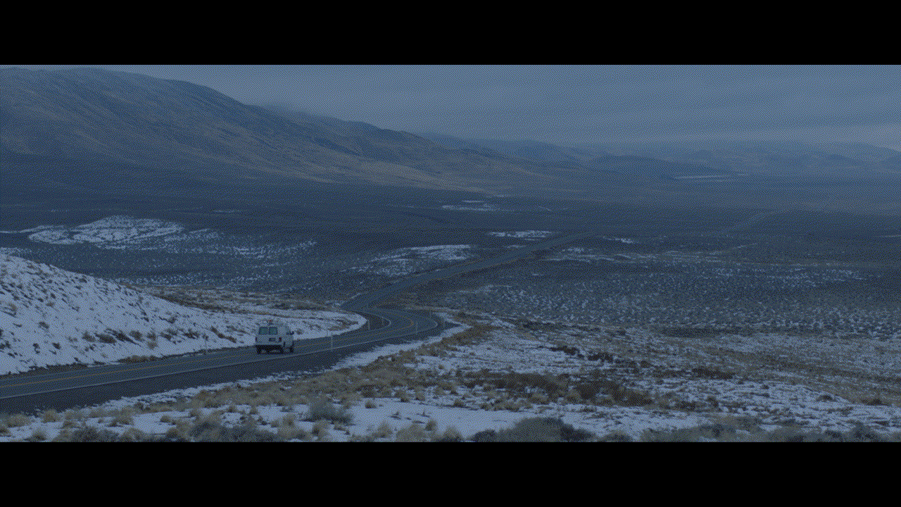
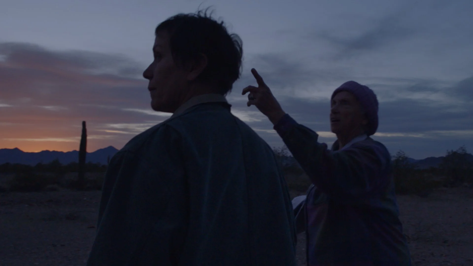
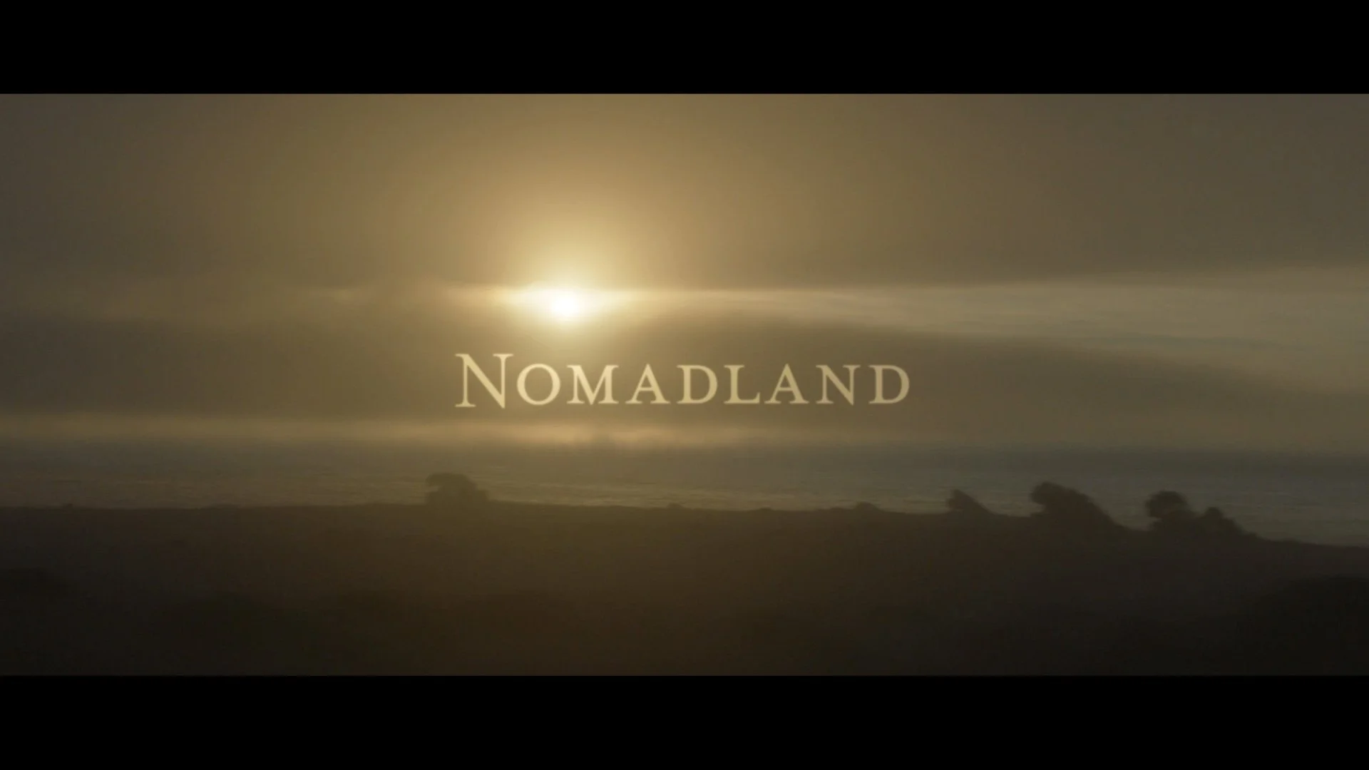
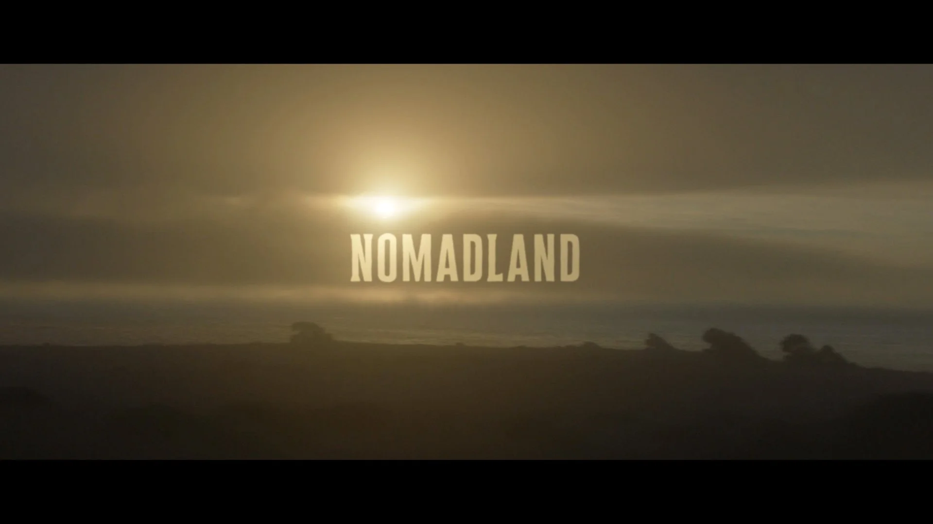
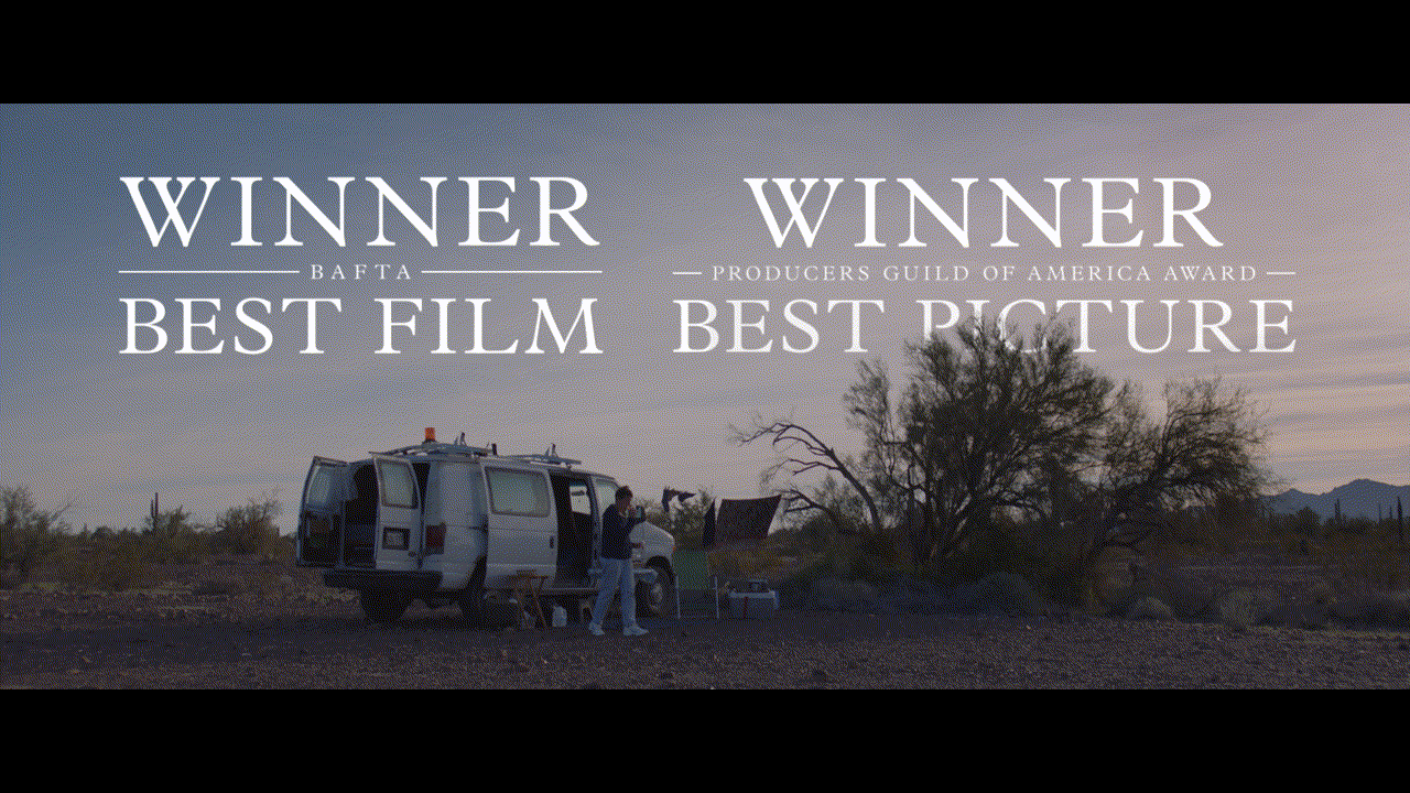
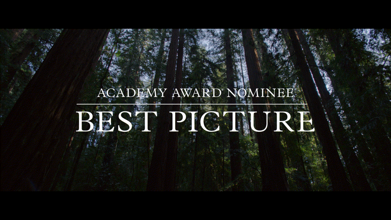
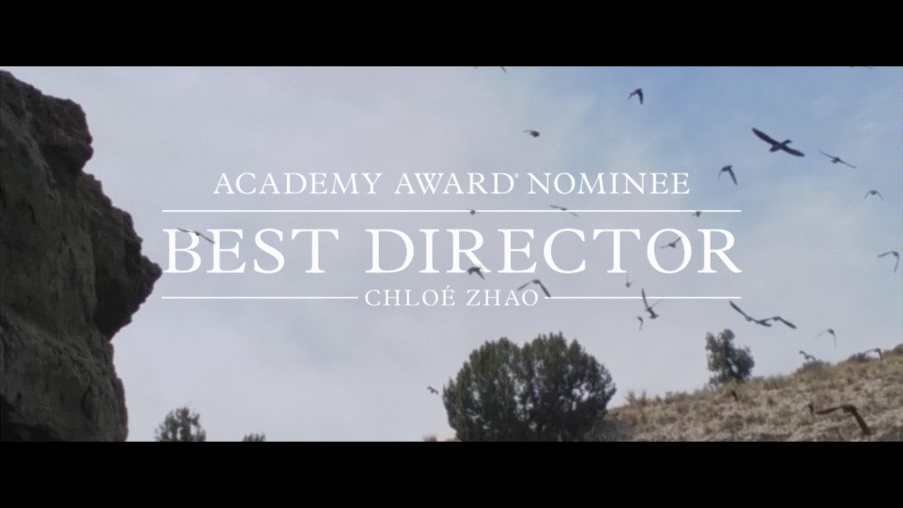
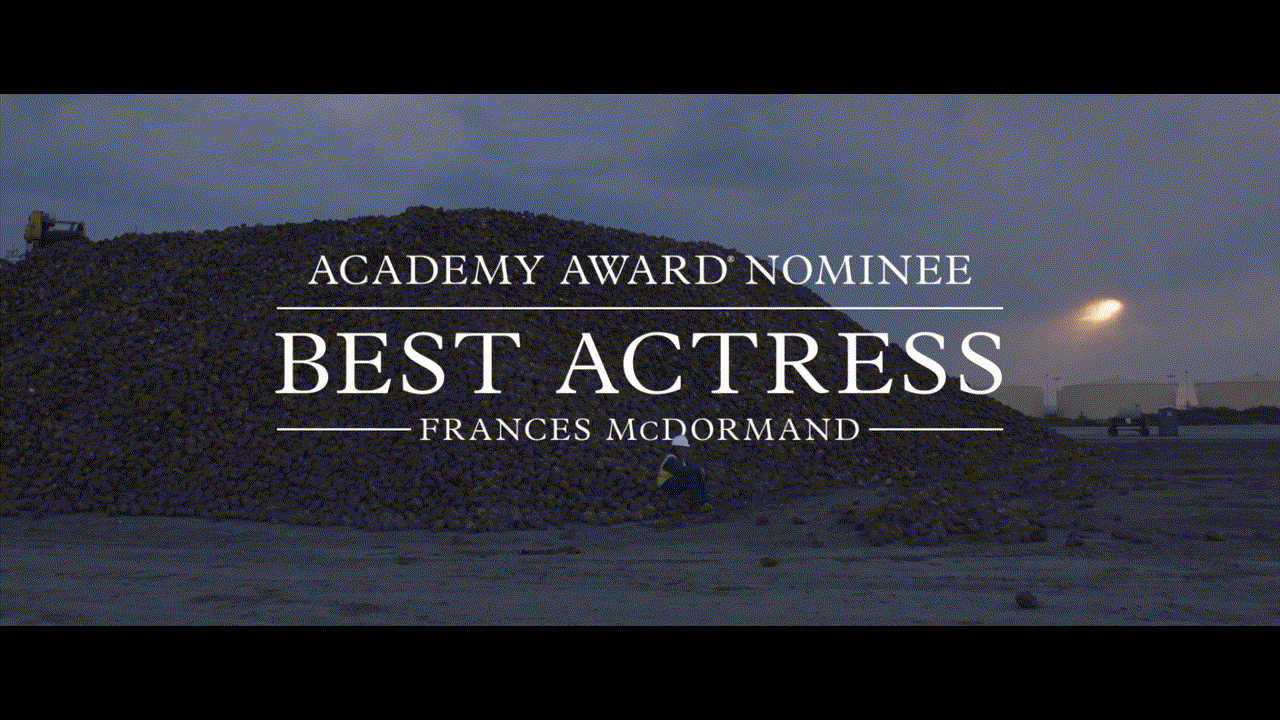
The initial pass of this project used a thin, condensed sans serif that evoked a tone of prestige and elegance. The project came to my plate after the director Chloé Zhao asked for a pivot — her direction was to explore something more colloquial, more ordinary to the everyday person. We landed on the typeface Plantin, a design that is credited as the direct ancestor of Times New Roman. This font choice remained with the campaign from the first teaser to the final awards spot (though down the line the main title itself became Arial). One graphic I’m particularly proud of is the large laurel wall. Similar to the campaign at-large, we wanted to emphasize word-of-mouth communication, and one way we did that was through highlighting the film’s numerous audience awards. The images above are excerpts from the teaser and trailers, which can be found in full below.

Teaser Trailer

Trailer 2
Review Trailer
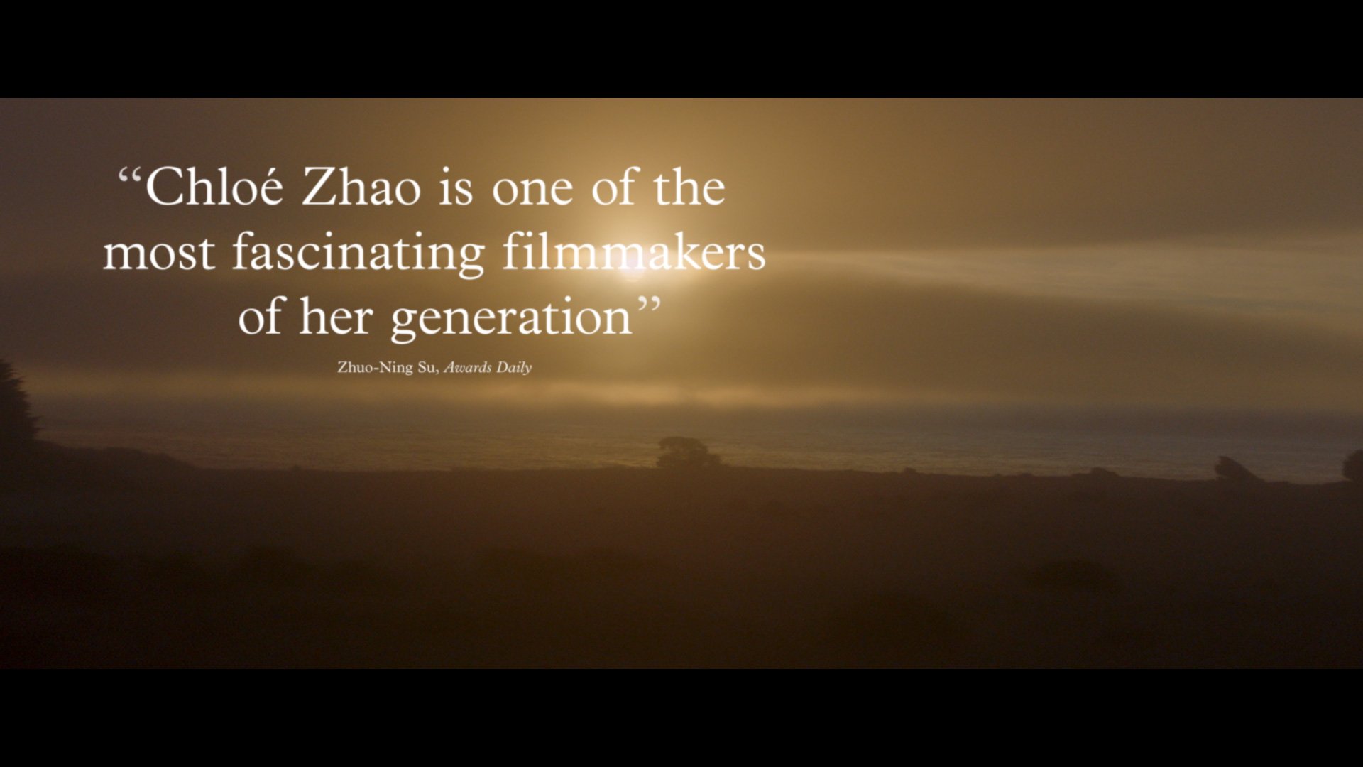
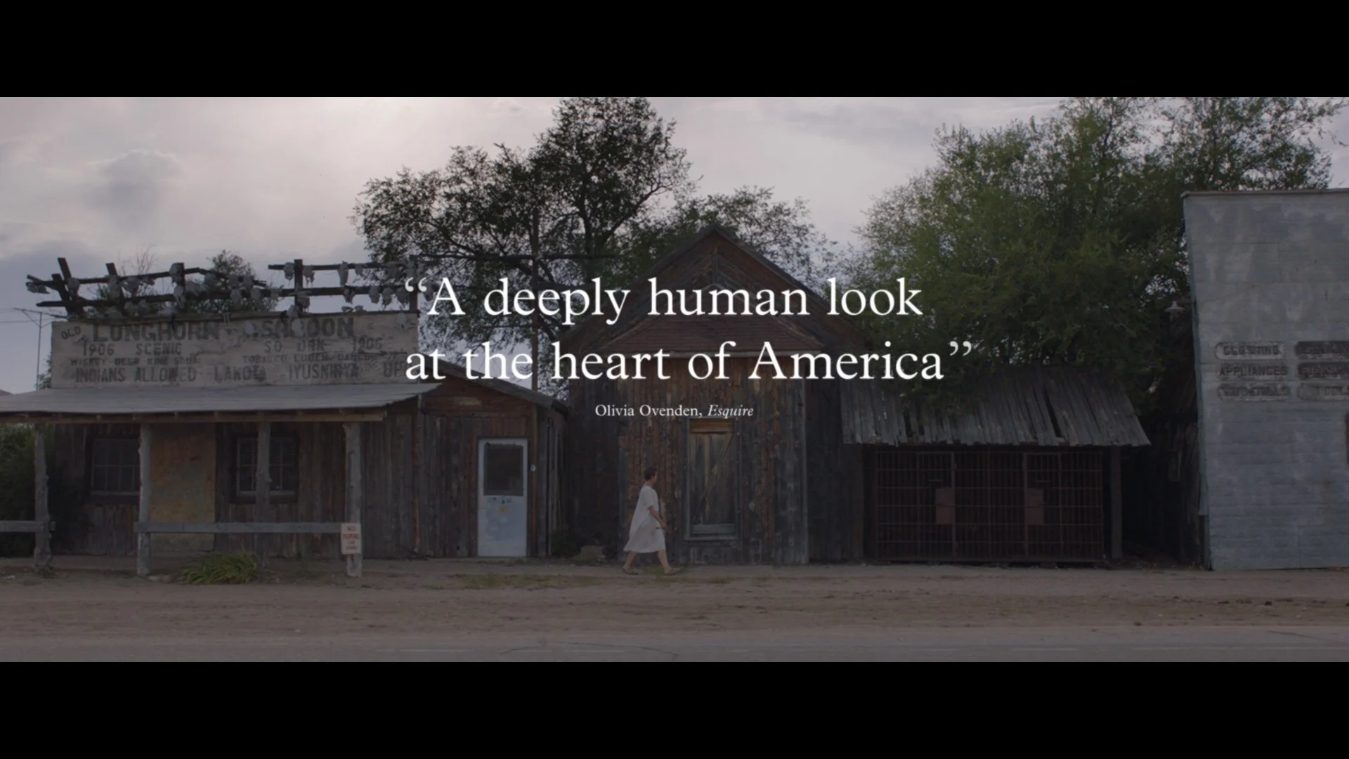
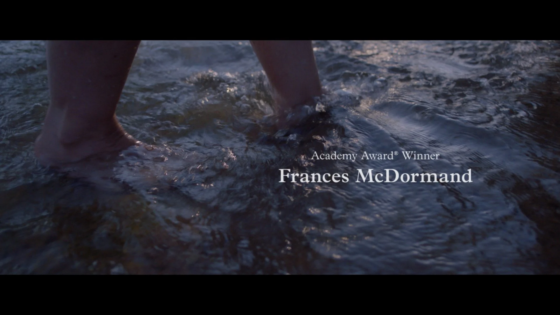
Below are select samples of other title explorations. I had tried to affect color and opacity, however we ultimately returned to the simplicity of white type over picture.
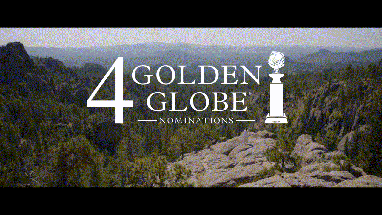
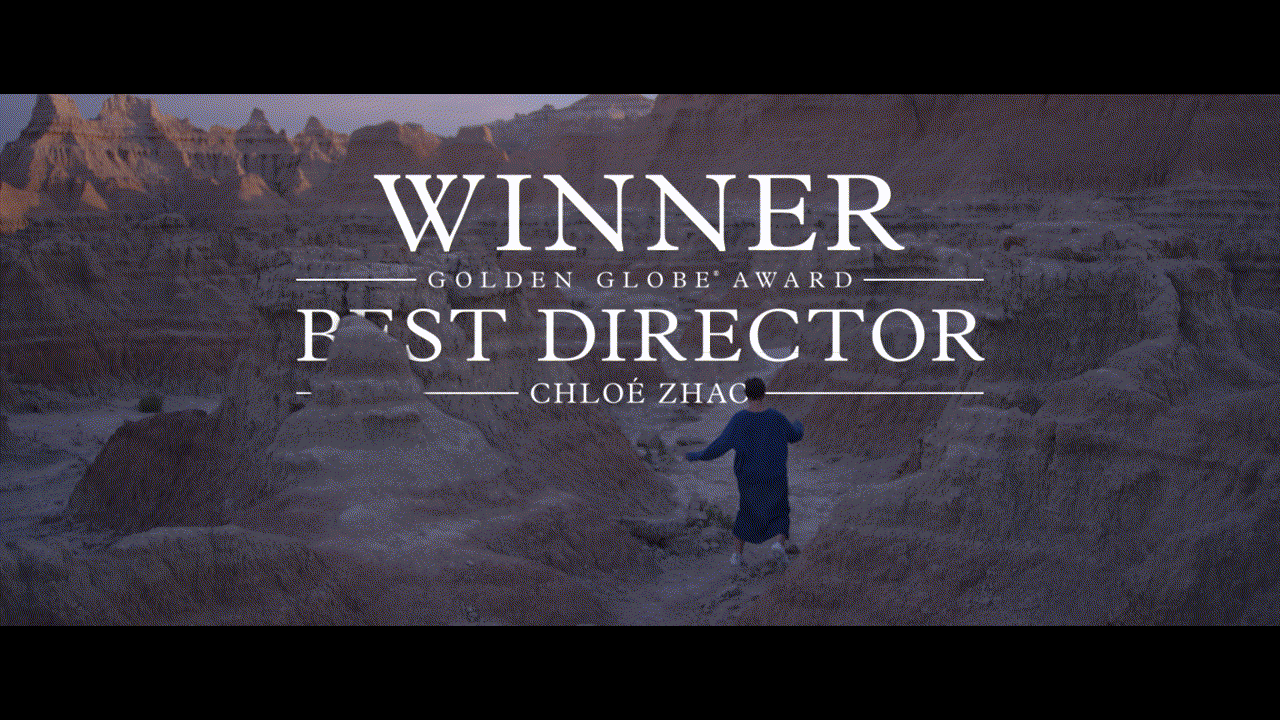
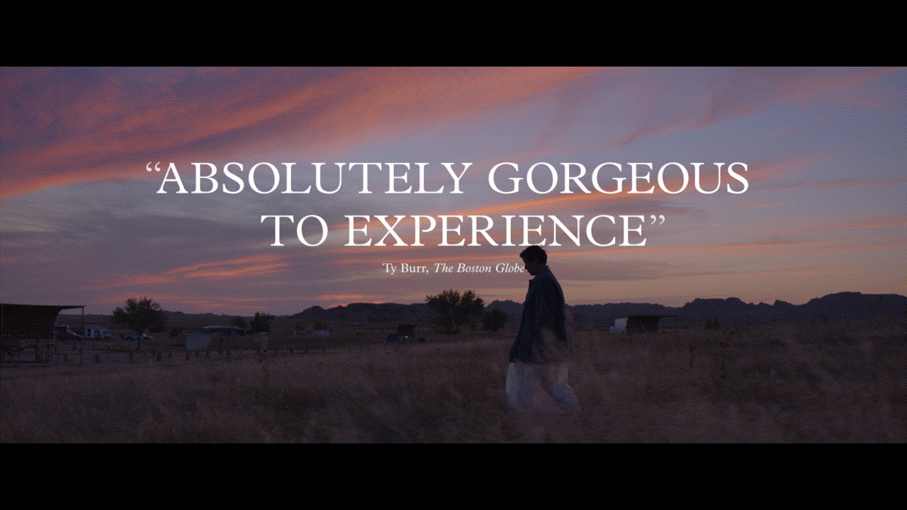
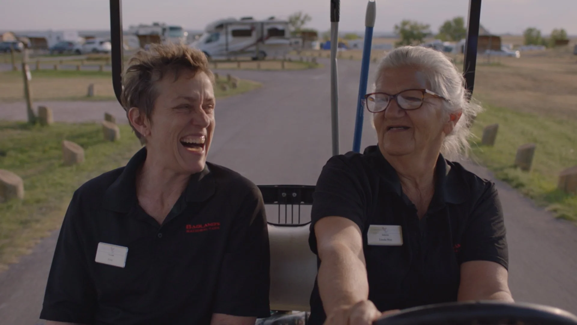
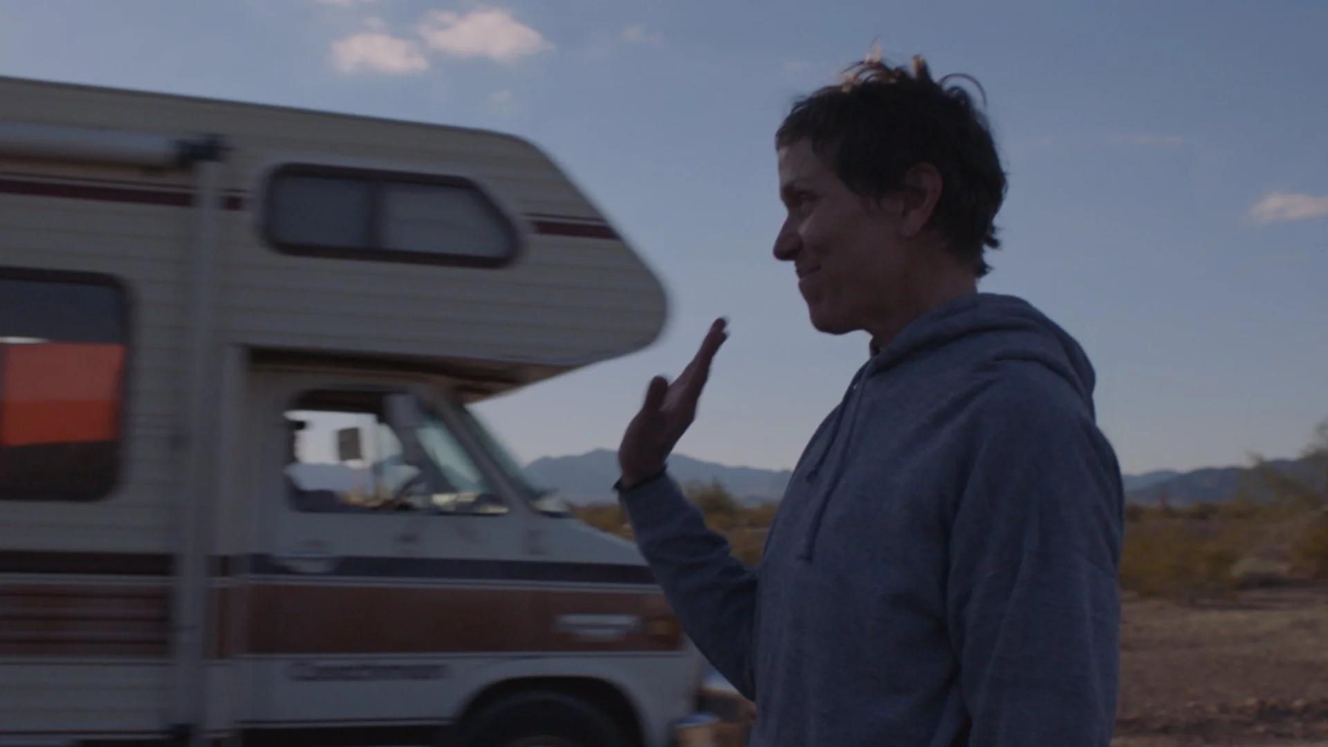
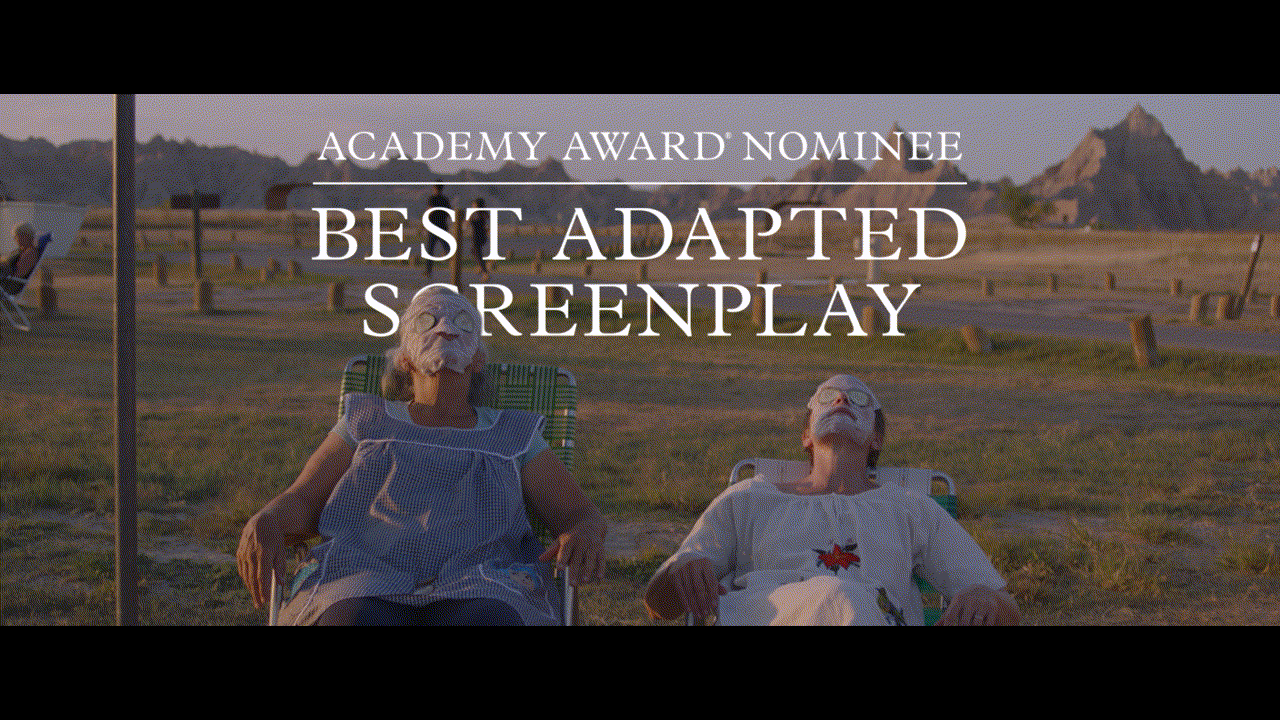
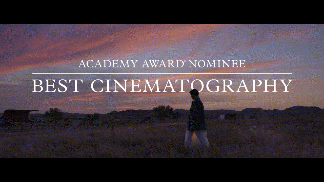
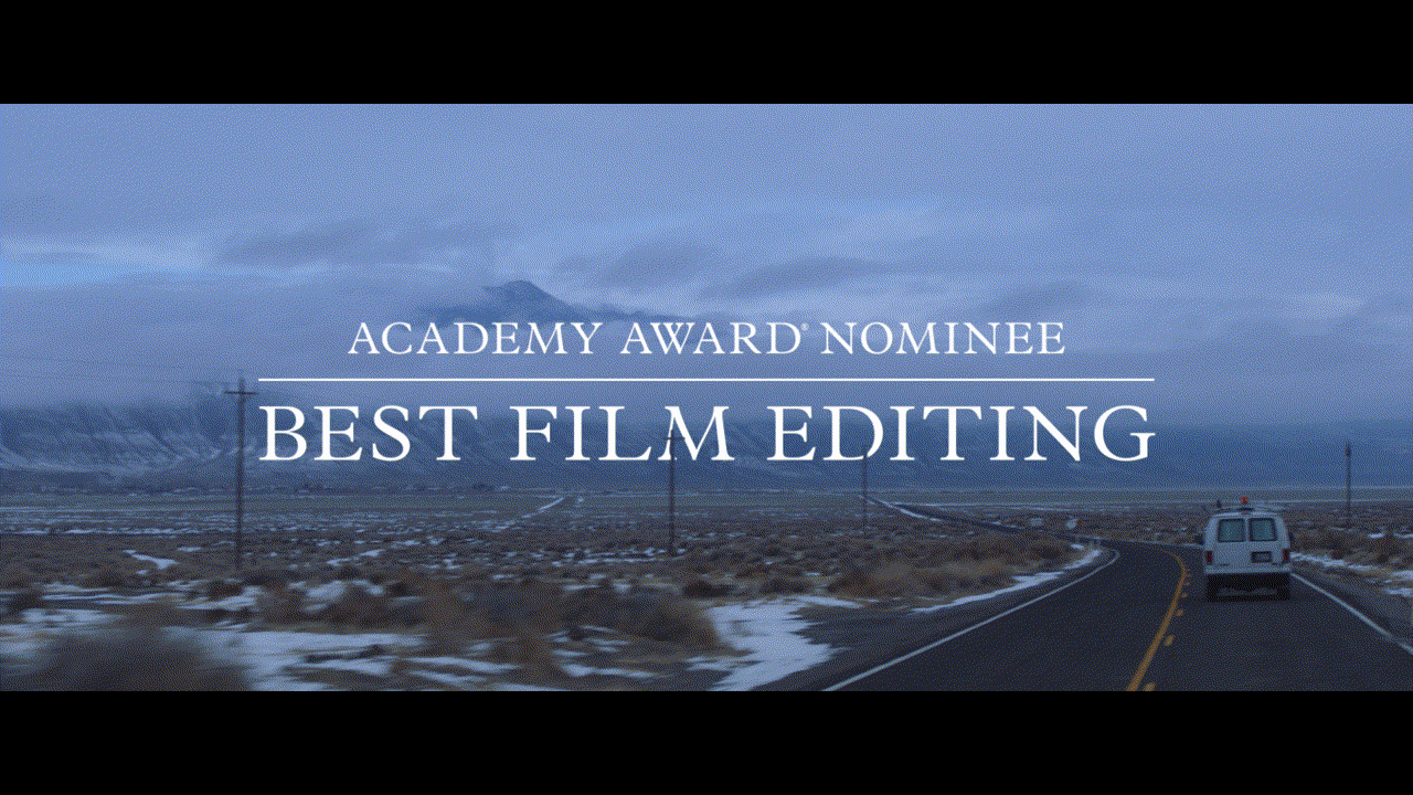
The film went on to dominate this particularly unusual awards season. I credit the campaign’s success to being the perfect embodiment of the times — in a year where we were forced to shut down, this film evoked a universal desire to live more simply and more on the road. Graphically we kept things simple; despite the urge to add an awards gold, we kept everything white and incorporated rotoscopes to work in harmony with the lush cinematography. Below are sample graphics as well as their respective TV spots.

TV30 “Celebration”
TV30 “This Life / Ratty”
TV30 “Gorgeous”
The film made history at the Oscars and we made spots highlighting those nominations.
TV30 “Academy”

TV30 “America”