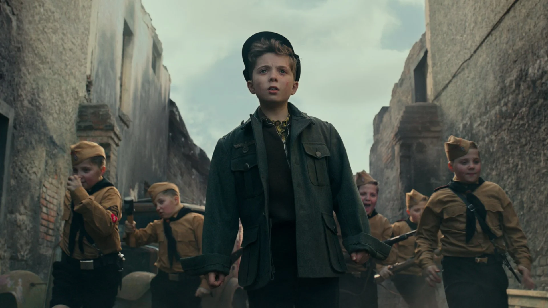
Jojo Rabbit
motion graphics // theatrical and TV
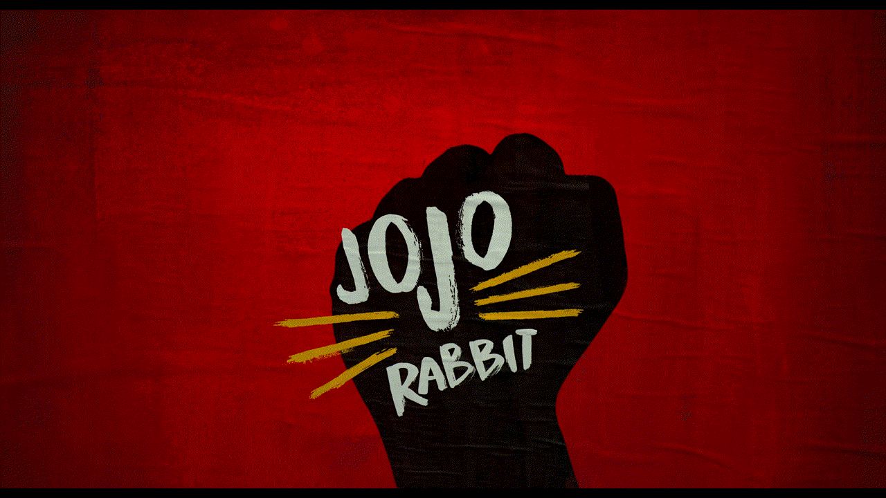


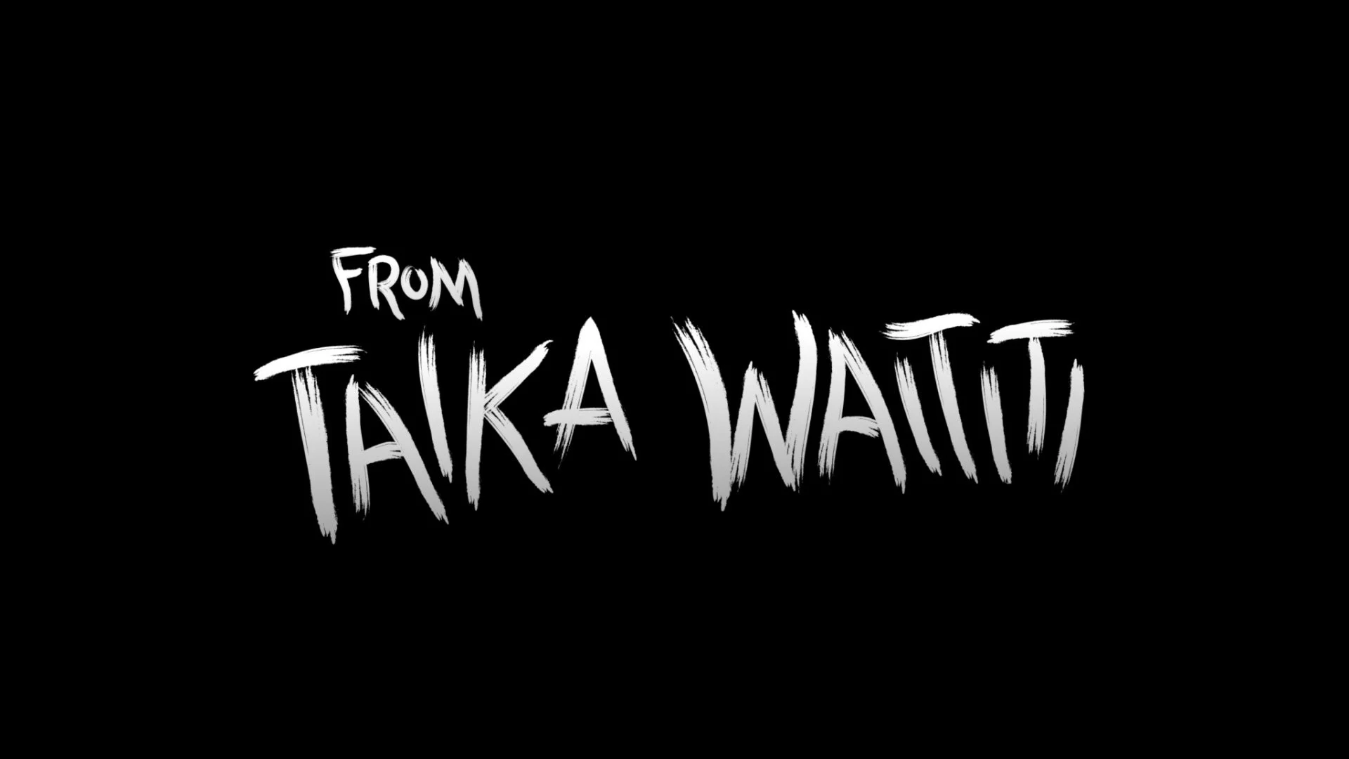
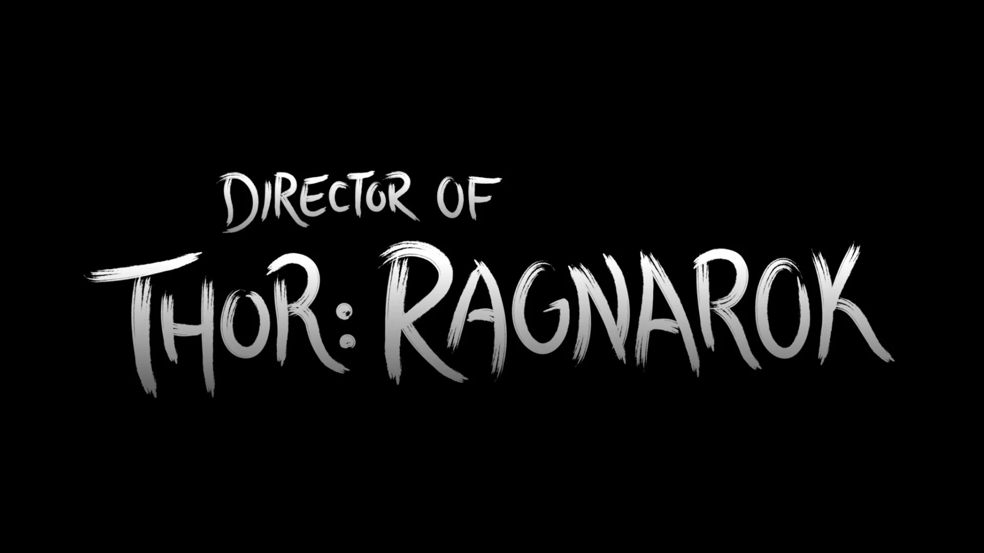
The graphics for this trailer needed to be within the Nazi Germany world while also winking at it from the outside. The finished piece adapts elements from the key art to create a brushed, poster look. The typeface Knucklebones is from the print campaign, however I resized, skewed and positioned each letter individually to feel more handmade. This is most evident when a letter is tucked underneath a T, when the stacked L’s sit on each other, and when an I is distorted to feel like a quick brushstroke. The font’s lowercase provided alternate letters that I mixed in from time to time so words like “Ragnarok” would use two different A’s.
The main title is a patchwork of a few different sources. The idea for bunny ears came initially from the key art, and Empire Design provided the idea for animating it. I found stock footage of bunny ears, posterized it and made it black to feel in line with the print campaign. The title lockup is taken from the poster. Below is the trailer, followed by our own brush explorations.
Theatrical Trailer
I had made these brush explorations by hand in Adobe Illustrator.

The film received widespread acclaim and we put forth a robust TV campaign to showcase that. The TV graphics are heavy in rotoscope and environmental work, placing reviews within scenes while also allowing pieces to move forward with little interruption. Below are selected graphics from our numerous spots.

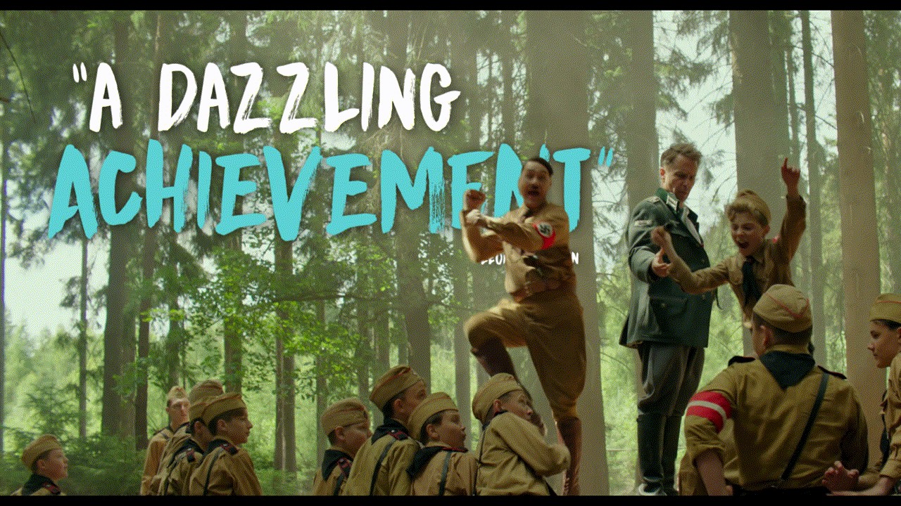
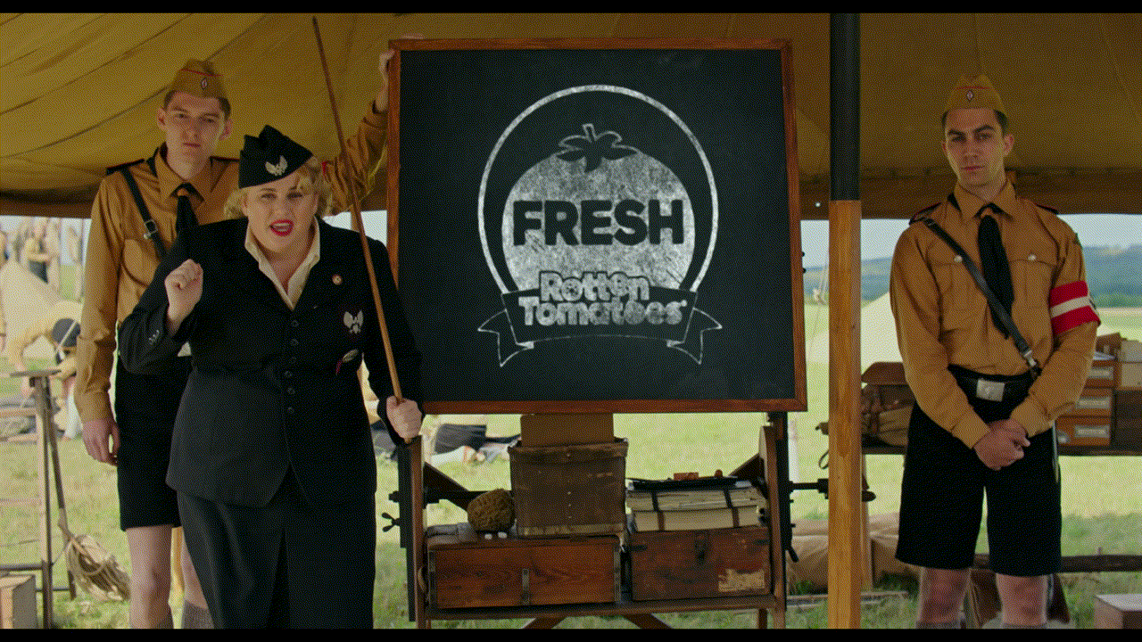
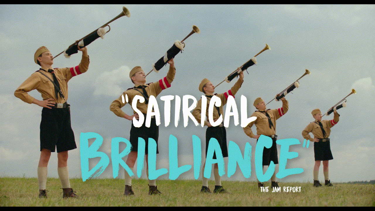
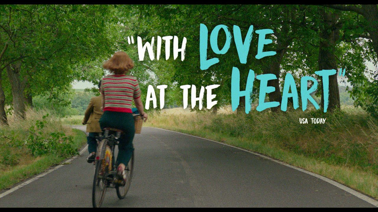
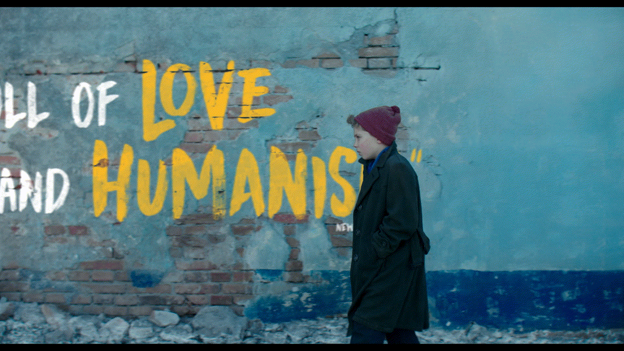
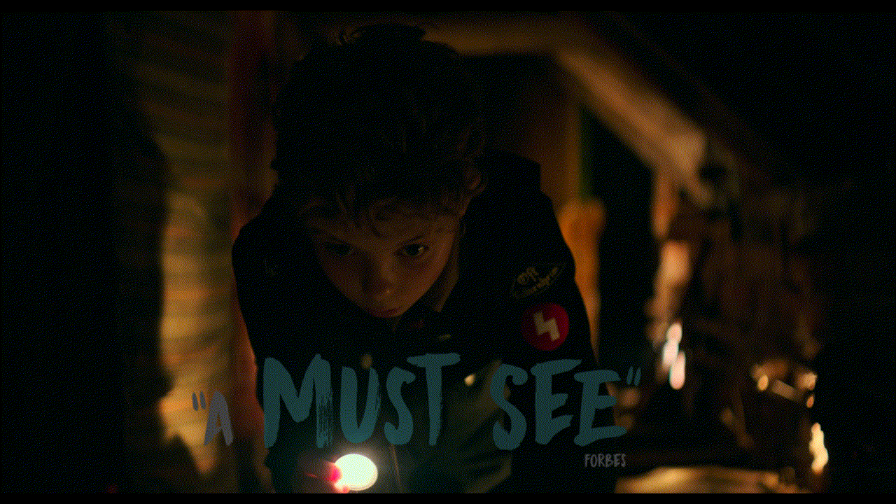
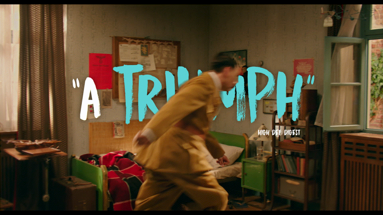
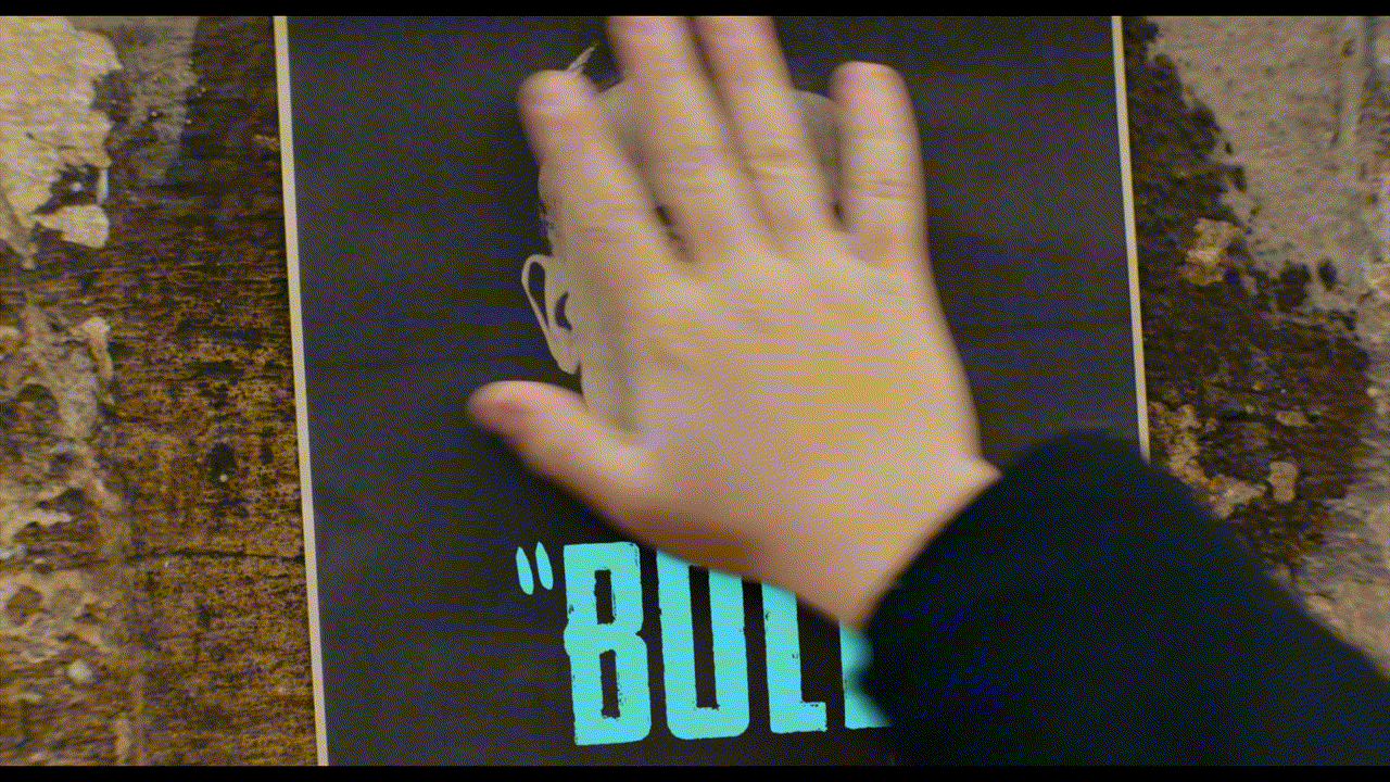
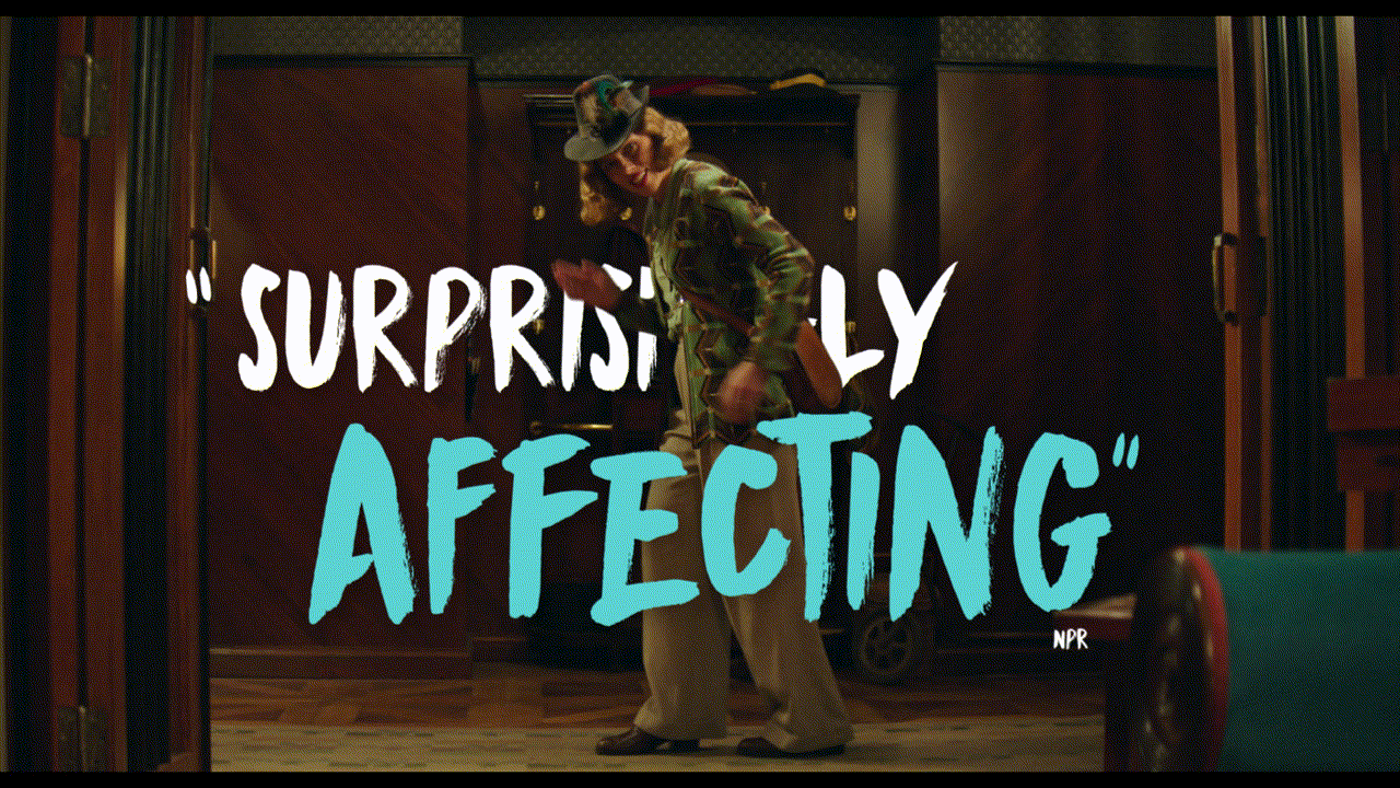
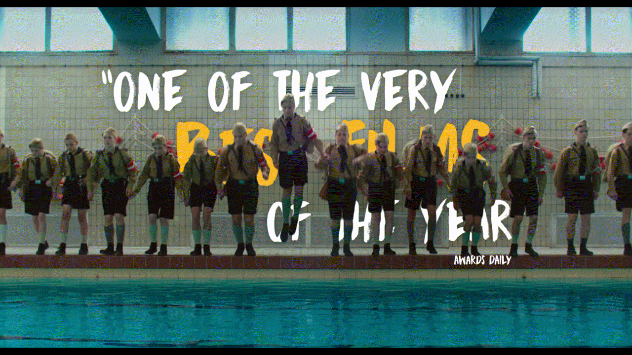
Below are TV spots I had worked on. Ralf Leeb made the unfurling flag 5 STAR review in “TV30 Unsinn”, all other graphics were done by me. “TV30 Unsinn” won the 2021 Golden Trailer Award for Best Graphics in a TV Spot (Film).
TV60 “Gesundheit”
TV30 “Unsinn”
TV30 "Gläubige"
TV30 “Liebe”
TV30 “Imaginar”