bodies bodies bodies
motion graphics // theatrical
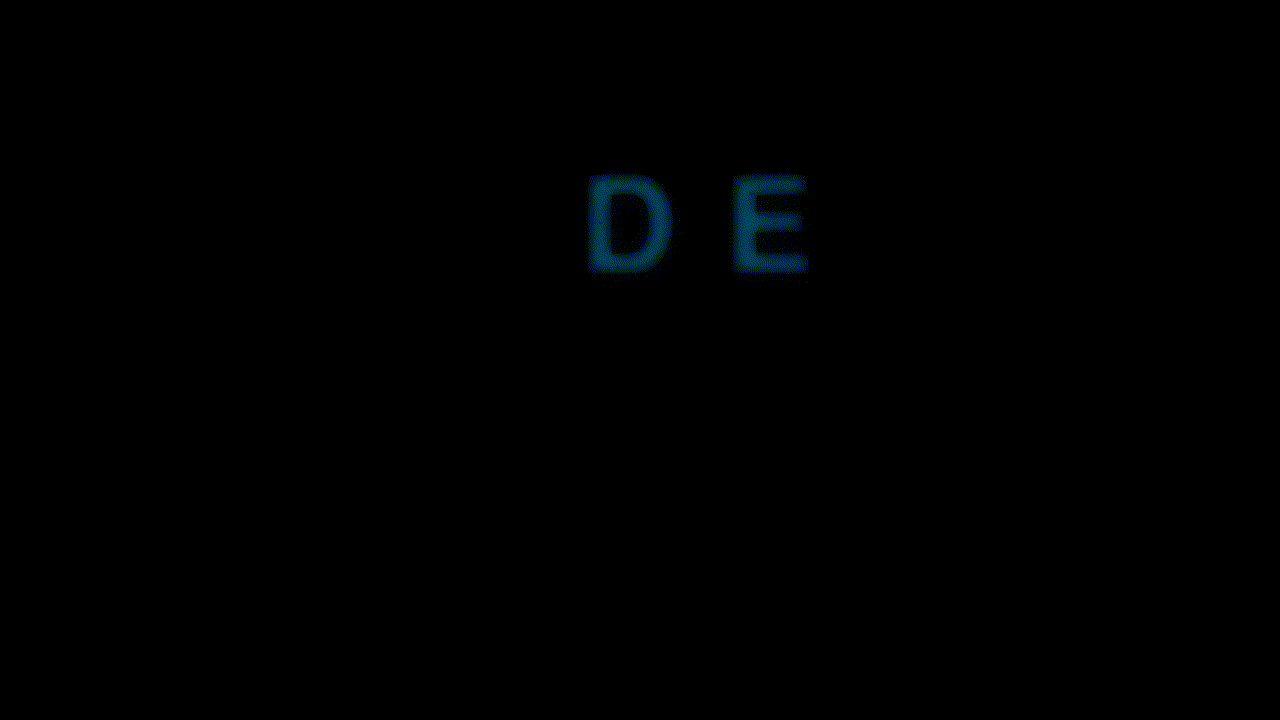
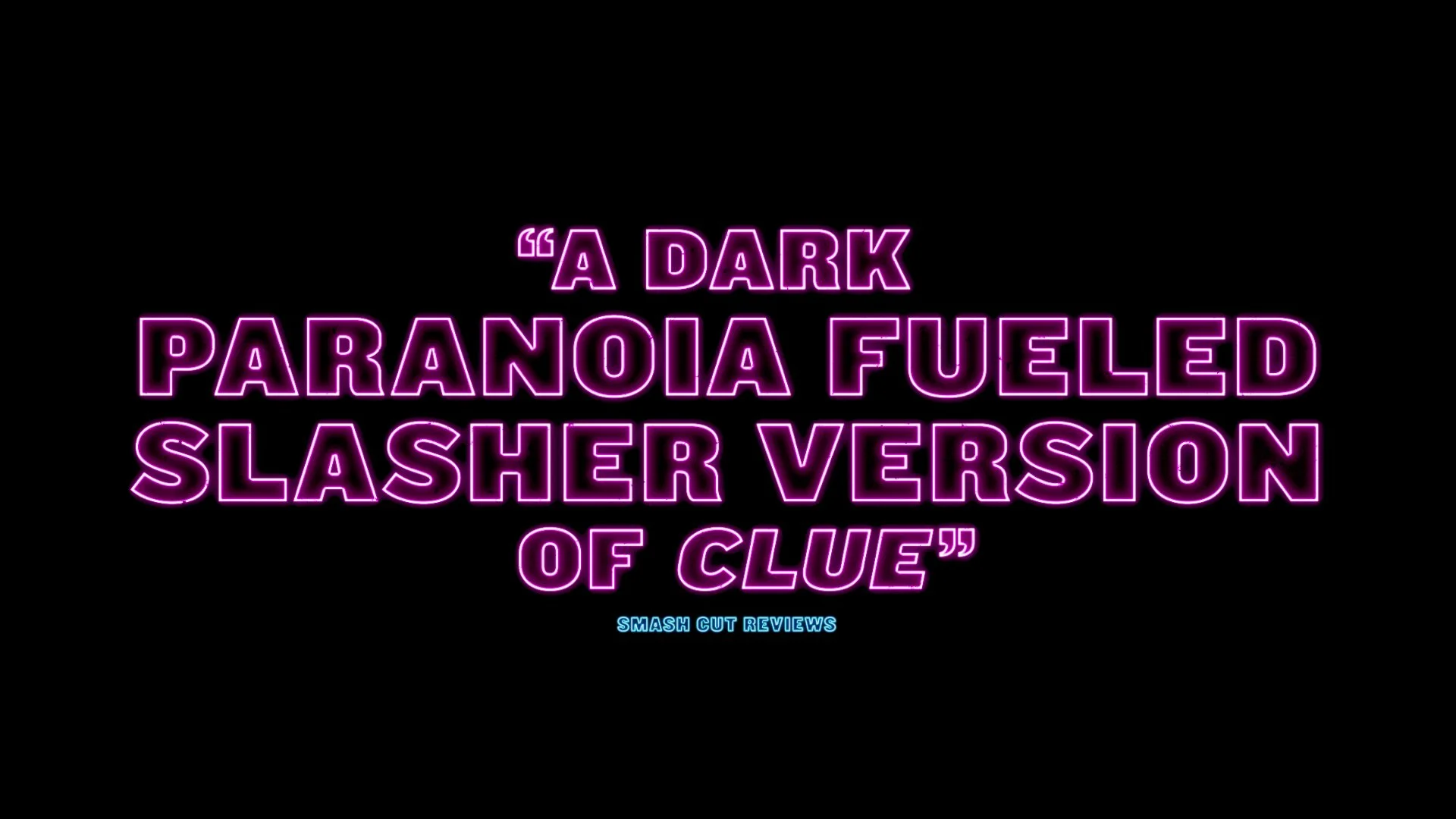
The direction of this project was to push toward a stark, in-your-face sans serif, and we landed on Helvetica Bold. I think this typeface works perfectly for the film because it’s so well-known and so assertively recognizable. Similar to how the film parodies internet language to the point where 100 years from now an anthropologist would need a PhD to unpack the things we say today, using Helvetica feels like a reflection on the media oversaturation that inspires a film like this. A copperplate serif like Elan would emphasize the horror aspects and even the humor, but I think Helvetica adds a layer of “we spend too much time online.”
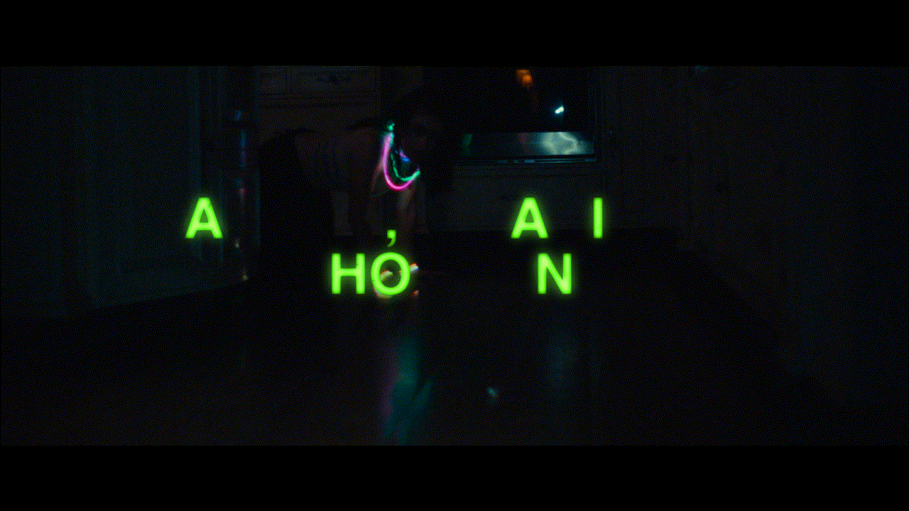
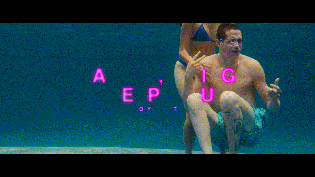
During the exploration for a new typeface, it also came up that the graphics shouldn’t be neon so much as similar to a glow stick. I understood this as making the fill of the letters the brightest element while burning the edges. We left the A24 logo closer to neon however as it felt more fitting with the logo’s letterforms.
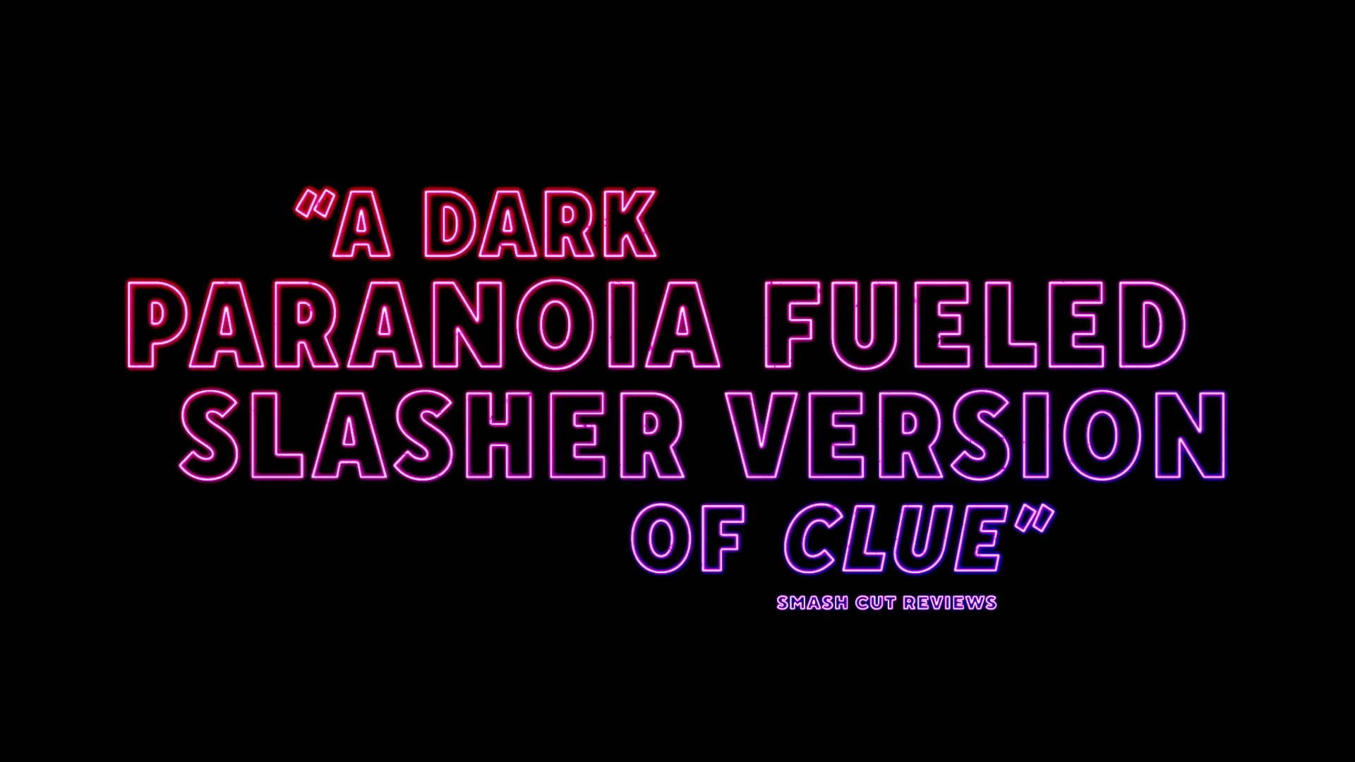
Below are selected samples of other sans serif explorations (pre-glow stick).
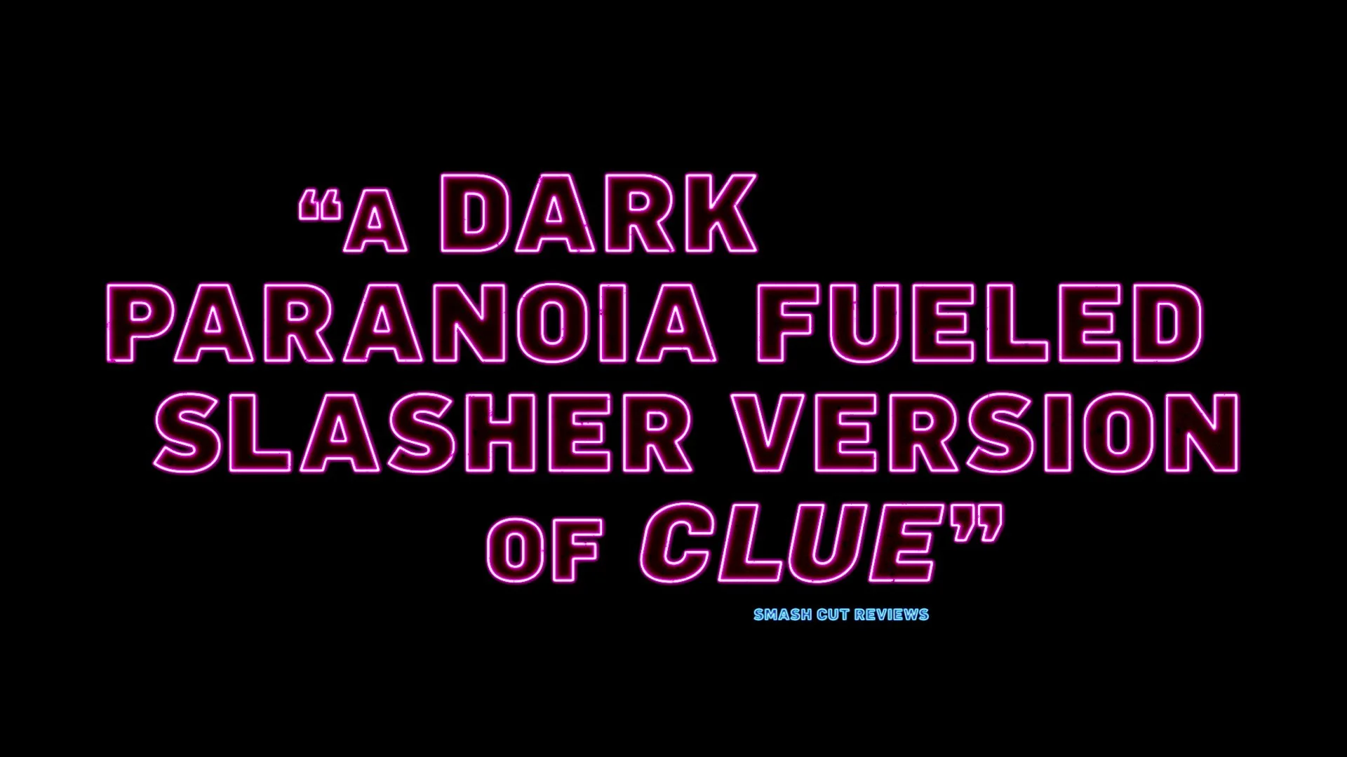
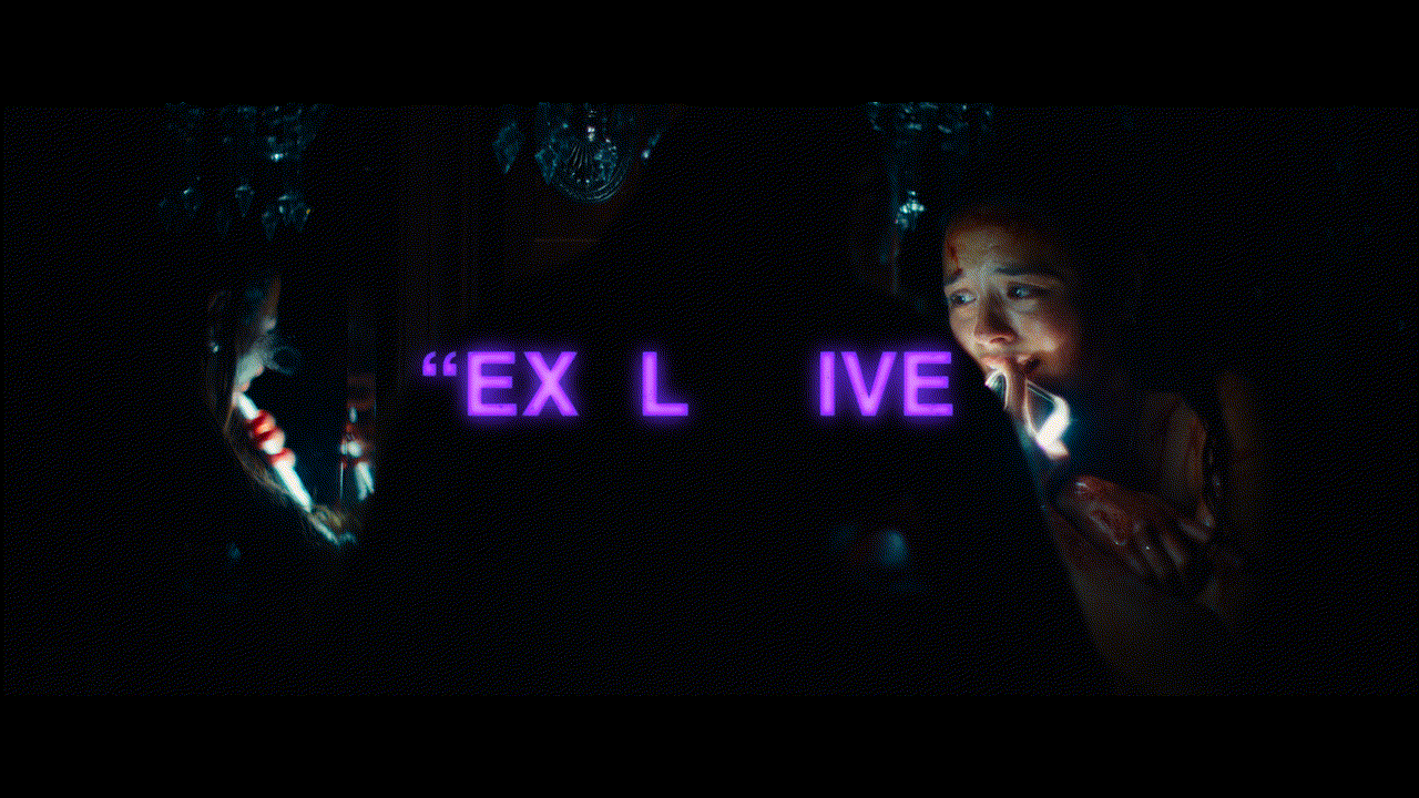
A24 decided to use this as the official title lockup for the poster as well as other campaign elements. Below is the trailer I worked on.

Official Trailer “Toxic”